Understanding House Energy Usage Statistics
- Background
- Data from my electricity provider
- A better way to visualize energy consumption
- 2010 - Electric radiators, hot water from air to water heat exchanger
- 2011 - New air/water heat exchanger (for both hot water and radiators)
- 2013 - Repaired air to water heat exchanger
- 2014 - Ventilation reduced from 80 to 59.7 m3/h in the kitchen, and by something similar in the bath room
- What if you don’t know your average monthly temperature?
- Comparison between the apartment and a heat sink
Background
This post is for those who have an electricity bill, and want to see how efficiently they are heating their house, their home, or their apartment.
I ended up with this method, since I found the traditional ways of presenting energy usage data far from intuitive, and the other ways didn’t give me any feeling whatsoever about what really was going on.
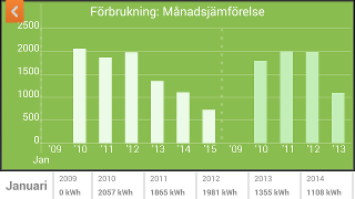
Data from my electricity provider
The ways of visualizing the energy usage data available from my electricity provider basically boils down to a couple of graphs, such as:
-
comparing energy usage for the same month over different years
-
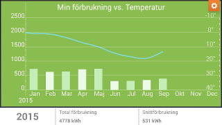
Energy usage and temperature vs month
-
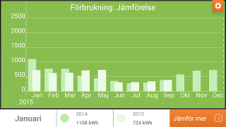
Two years side by side
My personal opinion about those graphs is that they completely miss to convey the most important piece of information: how your energy usage depends on temperature, and how you differ from your expected consumption at your current temperature.
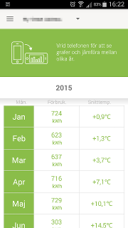
Luckily, my energy provider also had a table with energy consumption per
month and average monthly temperatures. The main drawback with their table is that you can’t easily compare energy usage between different months unless the mean temperature was identical. We can fix their table (shown below) by turning it into something more intuitive and descriptive.
A better way to visualize energy consumption
What I wanted was a way to be able to compare energy consumption between different years. My solution was simply to plot energy consumption vs temperature in a graph. To me, it feels like the only sensible way to visualize the data, since the only real correlation we have is between temperature and energy consumption. The months will end up shuffled in the graph (depending on average temperature), but that’s the way they are supposed to end up.
I expected to get some really interesting graphs, since there have been a couple of changes to the heating system during the last years.
2010 - Electric radiators, hot water from air to water heat exchanger
Until 2011, we had electrical radiators in the apartments in our area. That’s quite an energy inefficient solution, as shown in the graph below.
But first some statements explaining the graph:
-
Each point in the graph corresponds to a month, and the dots position depend on average monthly temperature and monthly energy consumption.
-
There is a very clear and linear relationship between average outside temperature and energy consumption.
-
The dotted line in the graph is a least squares fit of all the data points.
-
The equation of the fitted line is written in the top of the graph area
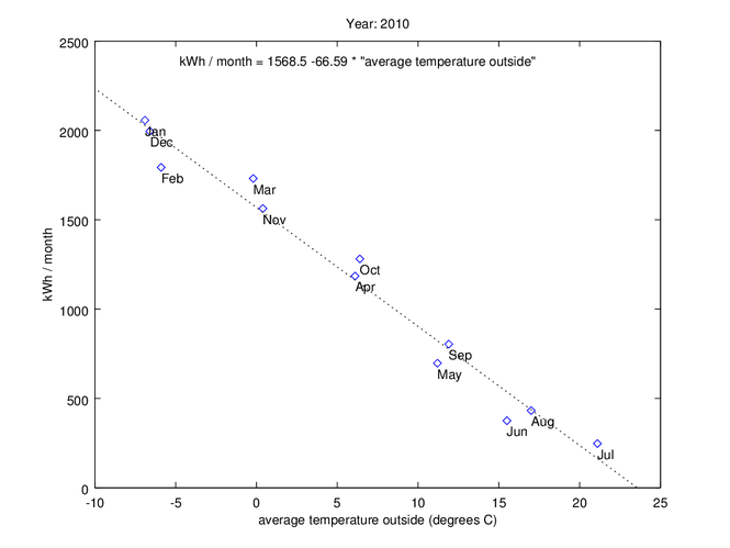
The conclusions I draw from the plot above is that:
-
a straight line is a good approximation to the energy usage of my apartment.
-
The line model works up to July (21.1 degrees C), but not for higher outside temperatures. The reason for that is that I still consume about the same amount of base electricity for everything else than room heating even if it would be 25 degrees C outside.
-
The equation of this line (kWh/month = 1568.5 - 66.6 * “average outside temperature”) can be used to calculate the expected energy consumption for any given outside temperature. You can immediately see that I would have used 1568.5 kWh/month if it was zero degrees outside constantly.
-
The equation for the fitted line also tells us one very important fact:
For each degree C that the outside temperature drops, we will use 66.6 additional kWh/month.
I want to emphasize the last point one more time: The slope of the fitted line tells us the change in energy consumption per unit change in temperature. In a simplified world, this would mean that the slope would be identical for the same apartment but with a different indoor temperature. The only thing that would happen to the graph would be that everything gets shifted the right (higher indoor temperature for the new situation), or to the left (lower indoor temperature for the new situation).
In my case, increasing the indoor temperature by one degree would use an additional 66.6 kWh/month every month regardless of the outdoor temperature. My logic behind that is that the heating system can’t know the difference between increasing the indoor temperature by one degree, or decreasing the outdoor temperature by one degree.
The other factor that typically differ between apartments is their non-heating related energy consumption. A simple assumption could be to assume that the consumption is roughly constant throughout the year. That would not give any change to the slope of the fitted line. It would only move the fitted line upwards (higher static energy consumption), or downwards (lower static energy consumption)
This would mean that the heating “performance” could be boiled down to a single number, the slope of the curve (66.6 kWh/month in my case). And that number would still be valid if you compare the same apartment to itself with identical conditions, or if you compare your apartment to a similar one but a few degrees hotter or colder, or if you even would compare your apartment to another apartment with fewer or more people in it.
2011 - New air/water heat exchanger (for both hot water and radiators)
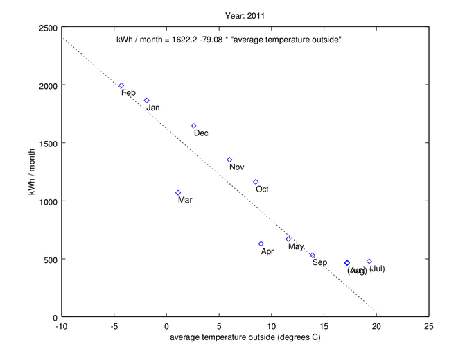
In the spring of 2011, we got a new heating system. It looks like it worked as expected during maybe part of Mars and April, but after that, the performance dropped down to numbers looking worse than the old electric radiator system!
There were no warning signs at all. It was first in the winter one and a half to two years later that I noticed it. At that point, the heat exchanger suddenly refused to run, and defaulted to only using direct electric heating.
It turned out that the reason was a tiny gas leakage in the cooling circuit. Too bad that the heat exchanger didn’t detect it until almost two years after it had occurred.
One interesting thing to note is that the energy consumption for June, July, and August were practically identical. I would say that the curve above maybe 17 degree average outside temperature don’t follow the fitted line anymore (by looking at this and all later graphs). For such high temperatures the fit look more like an almost horizontal line, so they should in my case be excluded by the line fit. If this would happen and at which temperature it would happen depend on a lot of factors, so use your own judgment if you are looking at this kind of graphs. The data points I’ve excluded are shown within brackets in the graph.
2013 - Repaired air to water heat exchanger
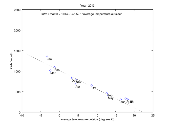
2013 was the first year when the new heating system worked as expected.
I usually turn off all radiators manually when it starts to be too hot during the summer. I could have turned off the circulation pump, but even though this heat exchanger still would run that pump for a short time every day (to prevent it from getting stuck), some house owners don’t dare, since it can be troublesome to start it again if it has been standing still for too long.
2014 - Ventilation reduced from 80 to 59.7 m3/h in the kitchen, and by something similar in the bath room
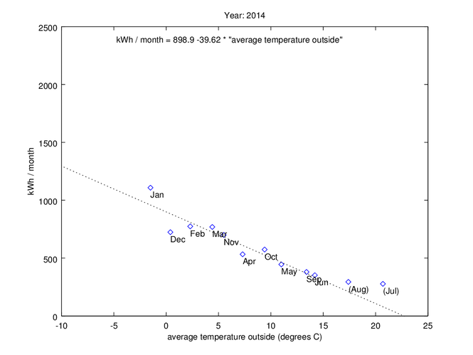
From now on, the ventilation in the apartment was reduced quite a lot. At zero degree C outside temperature, the energy usage dropped from 1014.2 to 898.9 kWh/month, which corresponds to an energy saving of 115 kWh/month, or 11%. If we look at 10 degrees average outside temperature instead, the difference in kWh/month is 56 kWh/month, which correspond to a 10% saving. Unfortunately, I didn’t pay attention to when they adjusted the airflow in the bath room. Otherwise, it might have been possible to figure out how much of the heating energy which is used to heat incoming air, and how much of the heating energy that escapes to the outside through walls, windows, the roof, and so on.
What if you don’t know your average monthly temperature?
I don’t have any suggestions for people living outside of Sweden. You would have to use your imagination. A bunch of people have weather stations which are connected to the Internet, and you might have one of those in your area.
If you do happen to live in Sweden, things would be simpler. You can browse the SMHI (Swedish Meteorological and Hydrological Institute) website. They have a “Ladda ner data” section, where statistics for any of their active temperature measurement stations can be downloaded.
Comparison between the apartment and a heat sink
For me, but probably not for most people, it would make sense to model the apartment as a heat sink. A typical heat sink is shown in the image below.
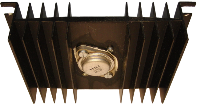
A heat sink doesn’t have to be more than a good heat conductor, which typically is used to dissipate heat from one point (such as the TESLA transistor in the image), to the ambient air.
Heat sinks are usually characterized by one coefficient with the unit degrees Celsius per Watt. That coefficient describes how much the heat sink would heat up if one watt of power was applied to it continuously. (The temperature increase is measured at the surface between the heating element and the heat sink).
One thing to consider is that the we could only measure the real applied indoor power back in the days when we had electrical radiators (i.e. the data back from 2010). Once heating of the apartment was converted to also used the air to water heat exchanger, the efficiency of conversion from electricity to heat goes far above unity. I have no data for the current heat pump, but we might get almost twice the energy out of the system than we put in in the form of electricity. For most intents and purposes, one could still use our heatsink analogy. (You would only get problems if you would try to calculate things such as the average thermal resistance of your walls, roof, windows, and everything else facing the outside).
Our slope for 2010 was 66.6 (kWh / month) per degree C. There is on average 730.5 hours per month, so (h/month) = 1/730.5 .
We could therefore reformulate our slope as 66.6*(1/730.5) = 0.0912 kW per degree C, or 91.2 Watt per degree C.
Inverting both sides to get the same unit as a heat sink, we would have 0.010968 degrees C per Watt.
That basically tells us that heating the inside of the apartment by one Watt will increase the temperature by 0.01 degrees C.
It would have been interesting to go deeper into the physics of heat transfer, energy required to heat air, expected losses through different parts of the building, and so on, but this will have to do for now.